Hunchat
Taking a video-only social media app for teenagers from concept to #17 on App Store's social Networking ranking
Year
2021
Roles
Research
User Testing
UX Design
UI Design
Scope
From concept to App Store
Duration
1 year
Overview
Hunchat was my first startup, we set out to build the best app for teenagers to talk with friends on video.
We observed that teenagers are always looking for ways to see each other on video - Snapchat, Instastories, TikToks, etc - yet the mainstream way to communicate online is still through text and voice messages.
User research was mostly made through direct observation and catering to specifically defined personas. That was followed by a lot of rapid prototyping to validate ideas get real user feedback, and iterate our solutions as fast as possible.
We took the app from concept to #17 in App Store’s Social Networking category.
High-level goals
Make teenagers feel like they are with their friends 24/7;
Create a user-friendly way to communicate through asynchronous video;
Become the best app to talk with friends on video;
Approach
Discovery
User research
Market research
Interpretation
Narrowing the scope
Ideation
Turning complexity into simplicity
Defining the app’s structure
Experimentation
Prototyping and testing
Evolution
Usage metrics shaping the product
Refining the designs
Pivoting into group chats
User research
Hunchat’s ideal users - from a business and networks driven perspective - are teenagers between the ages of 14 and 18 who attend high school in the United States and whose friend graph is mostly composed of classmates.
To build for an even more specific person and humanize the process, we created a persona to represent this ideal user: Clara
Clara is a popular 16-year-old high schooler from Boston whose whole friend group attends the same school and is very close. She mainly uses Snapchat to talk with friends, spends 1h per day on TikTok, and posts Snap Stories and Insta Stories daily. She is interested in dance, makeup, gossip, and juvenile literature.
Ideal user persona key points
What people say they want is very different from the products they actually want, especially in very nuanced areas like consumer social, so we decided to rely on observing users and the ways in which they use the existing tools instead of conducting user interviews.
Main insights from these observations:
- Users want to have video conversations with multiple friends asynchronously;
- Asynchronous video conversations are already happening in scattered ways throughout the web;
- When using a new product, teenagers need to understand it right away or they will churn;
- Video replies are their preferred way of communicating whenever the environment allows;
- Users want to share their video conversations outside of the app.
Market research
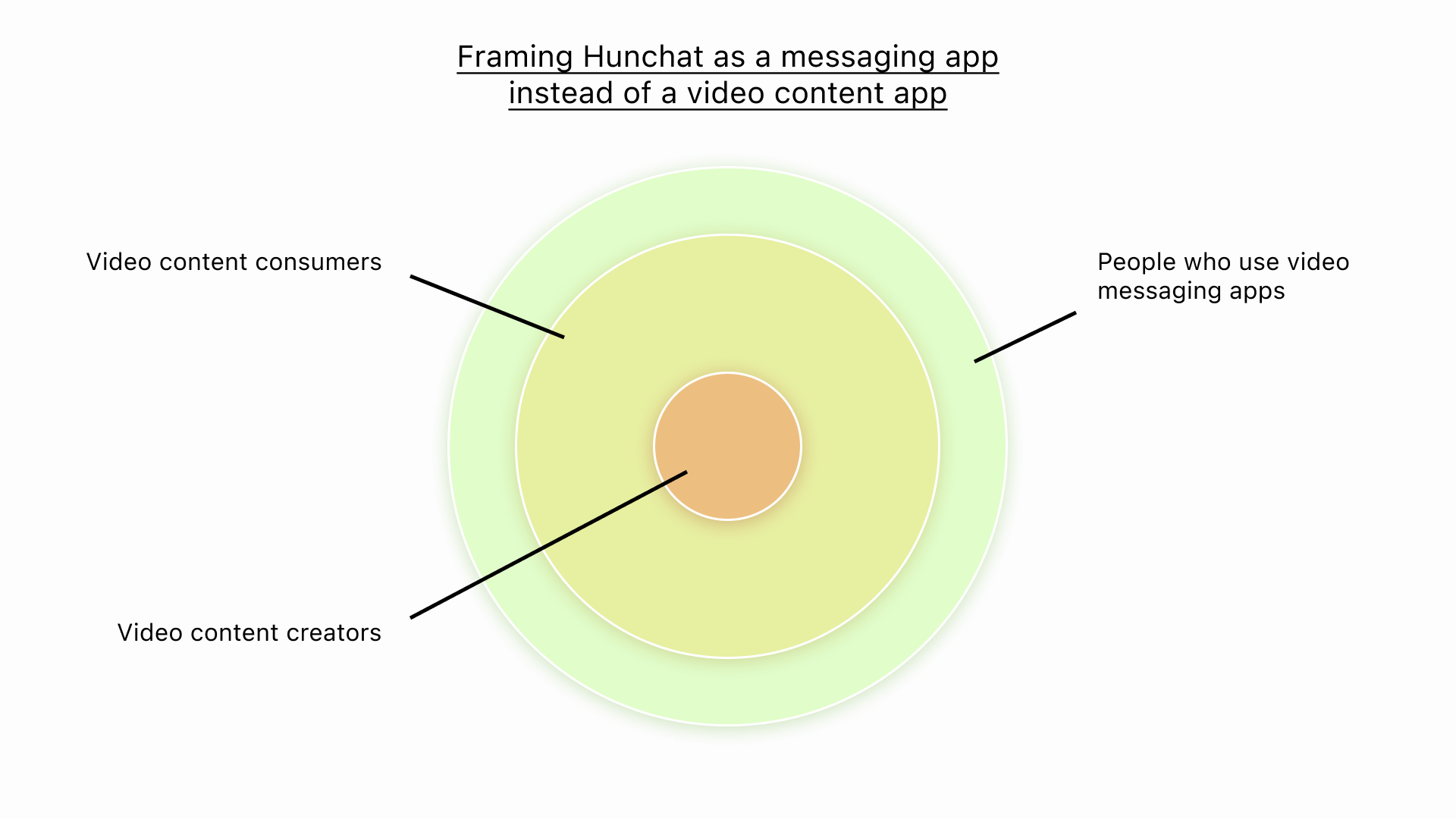
Hunchat is competing for a scarce resource: Teenagers’ attention.
Social media apps can position themselves in two different categories: Entertainment, like TikTok and Instagram, or Messaging, like Snapchat and WhatsApp. Hunchat lives in the messaging category, with a focus on close friends.
Hunchat's market positioning
There are a lot of new players appearing and succeeding in the consumer social space, like Dispo, BeReal, Poparazzi, and NGL. Most of them use a feature present in other social media apps and implement it in a novel way, while also taking away functionalities from their users to change their behavior.
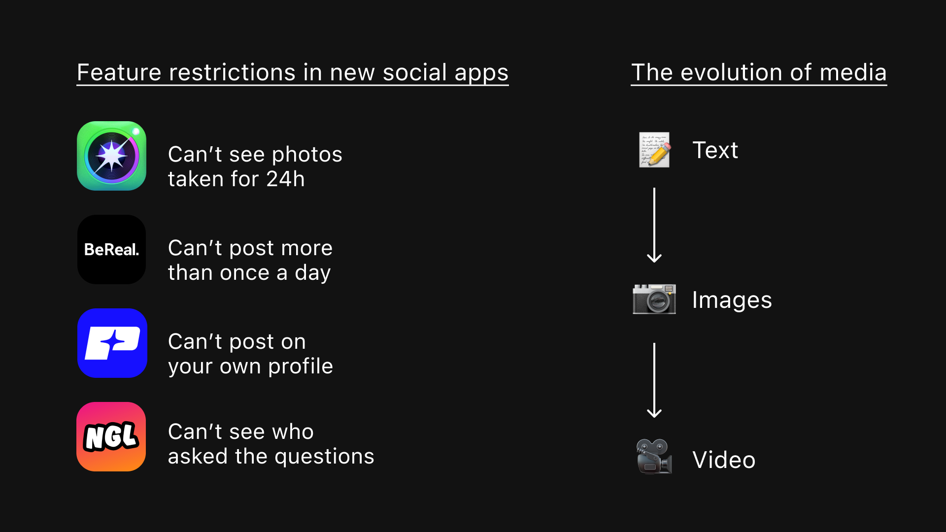
Competitor feature and medium evolution analysis
Turning complexity into simplicity
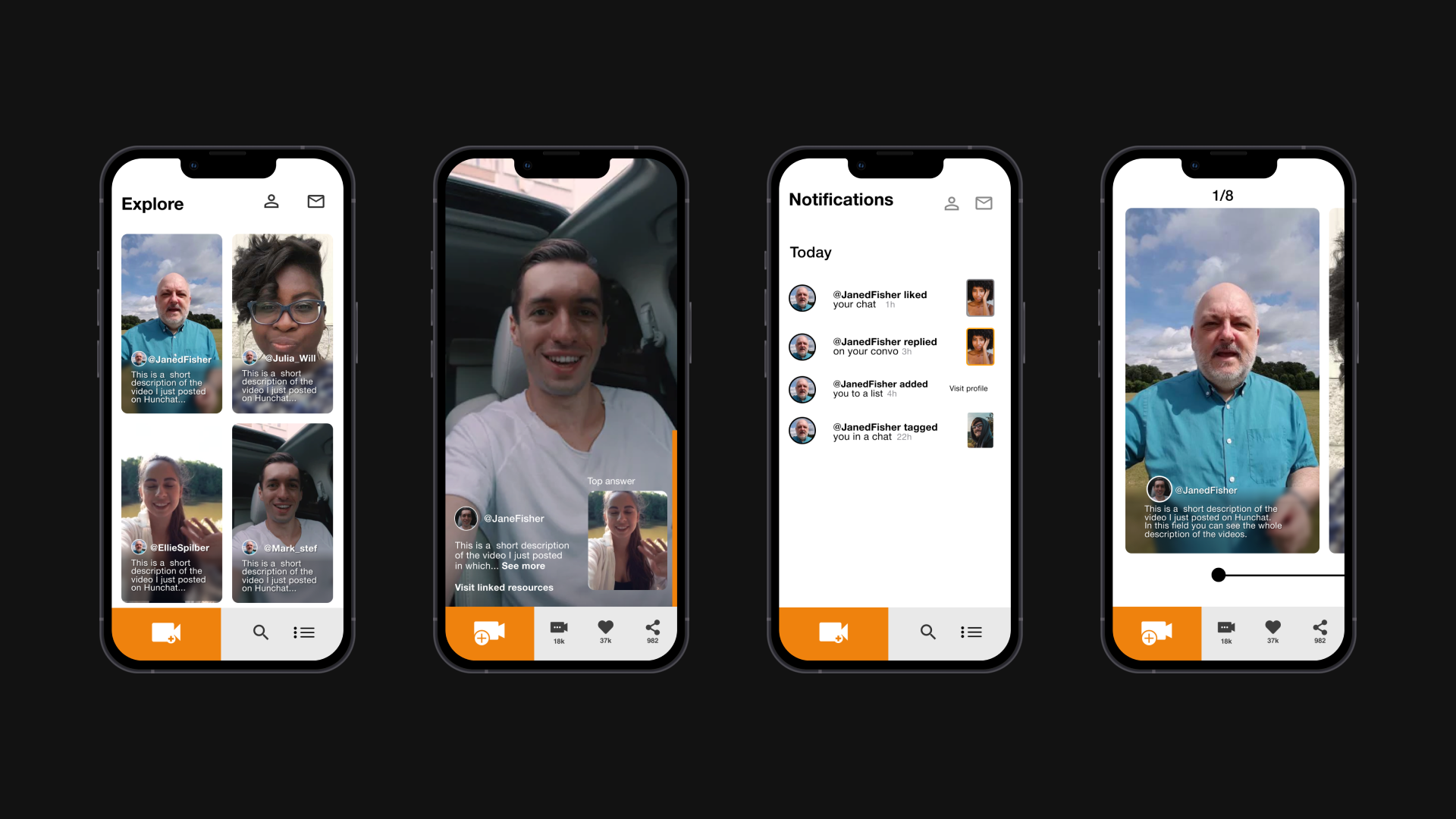
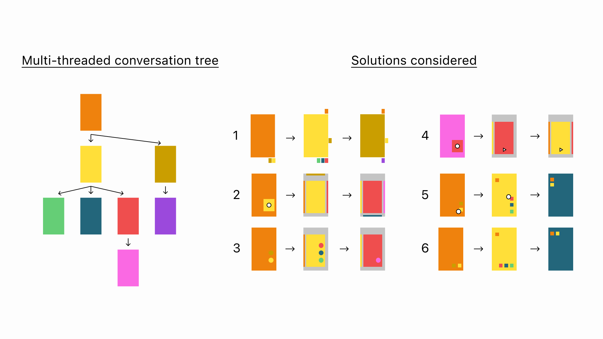
The first and most important experience we needed to develop to allow our users to have video conversations with multiple friends asynchronously was multi-threaded video feeds. Developing this was a fascinating information architecture challenge that I explored in detail in the “Solving information architecture for multi-threaded video conversations” section.
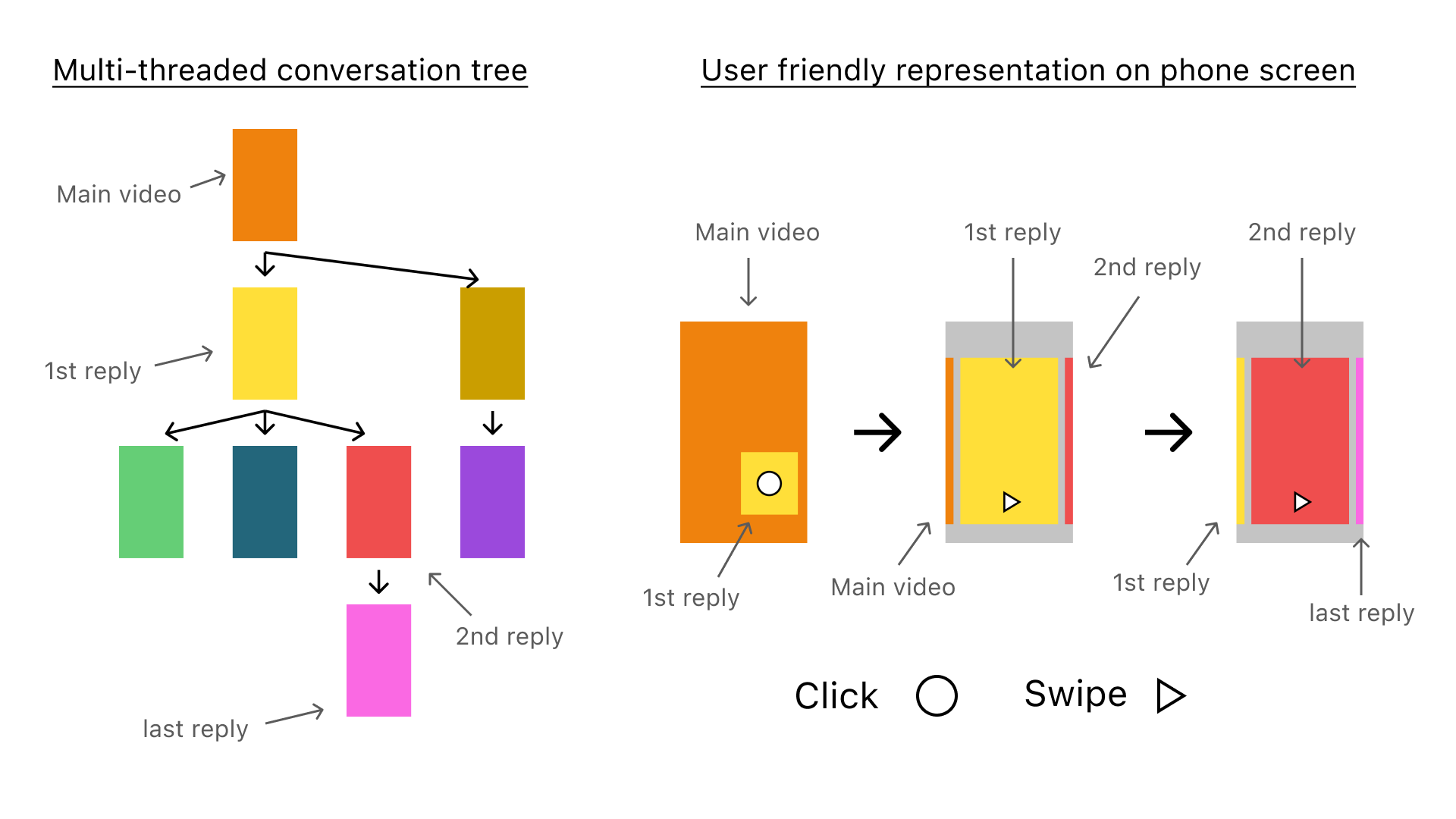
Visual representation of an intuitive way to browse multi-threaded video conversations on a phone
Narrowing the scope
In this planning phase, we kept our resources in mind and choose our course of action wisely.
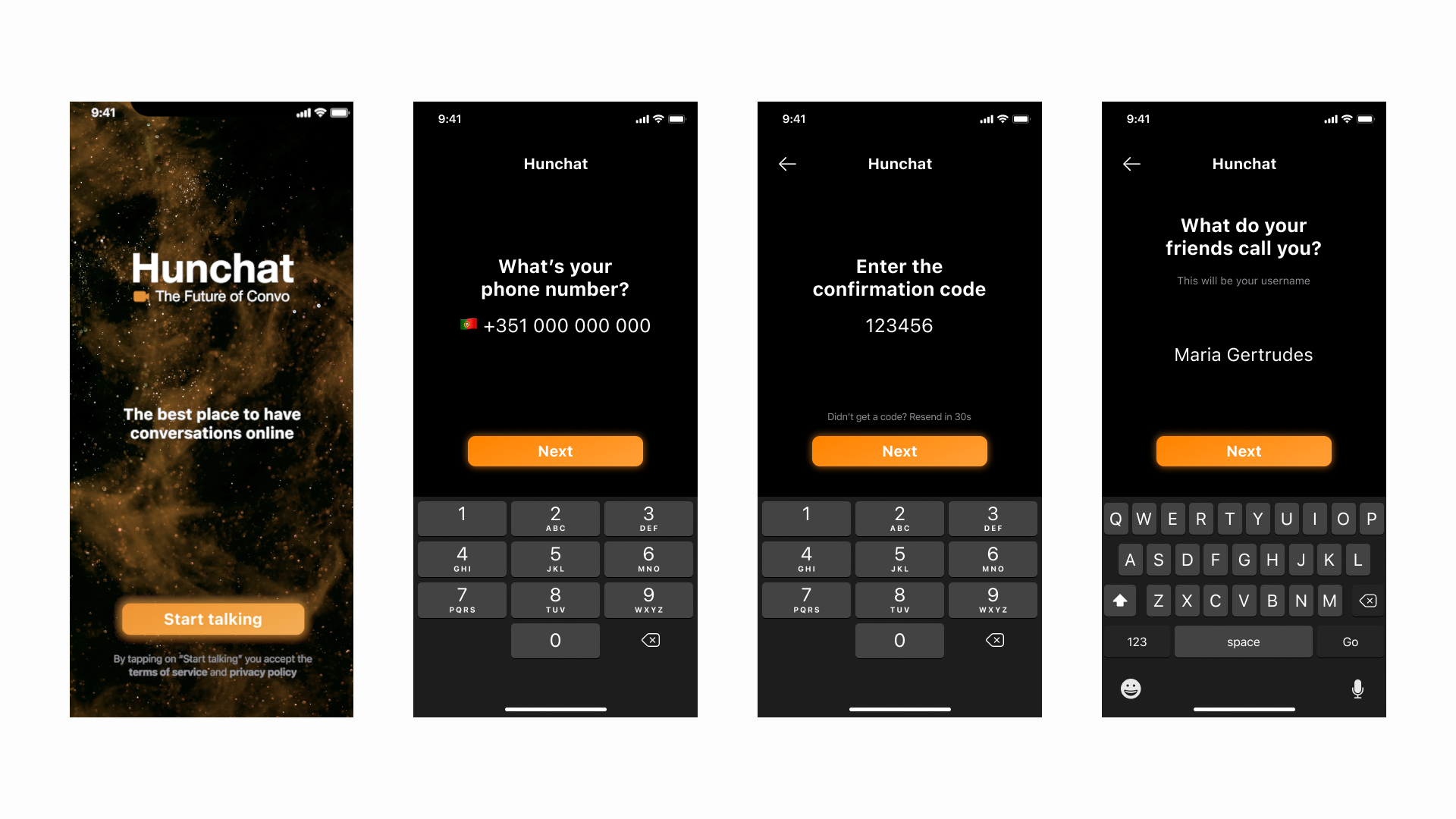
After analyzing the insights gained from observing potential users and contrasting that with the market landscape, we agreed to develop for iOS only as this platform is enough to test the viability of the product. This greatly reduced the complexity of the project compared to if we aimed to build for both Android and iOS. We also set out to first build an MVP that was functionally complete but aesthetically lacking to validate our core assumptions and put it in the hands of real-world users from the beginning.
Aestetically lacking MVP to test basic assumptions
Prototyping and testing
Given our scarce resources, figuring out what worked and what didn’t before actually developing it was crucial.
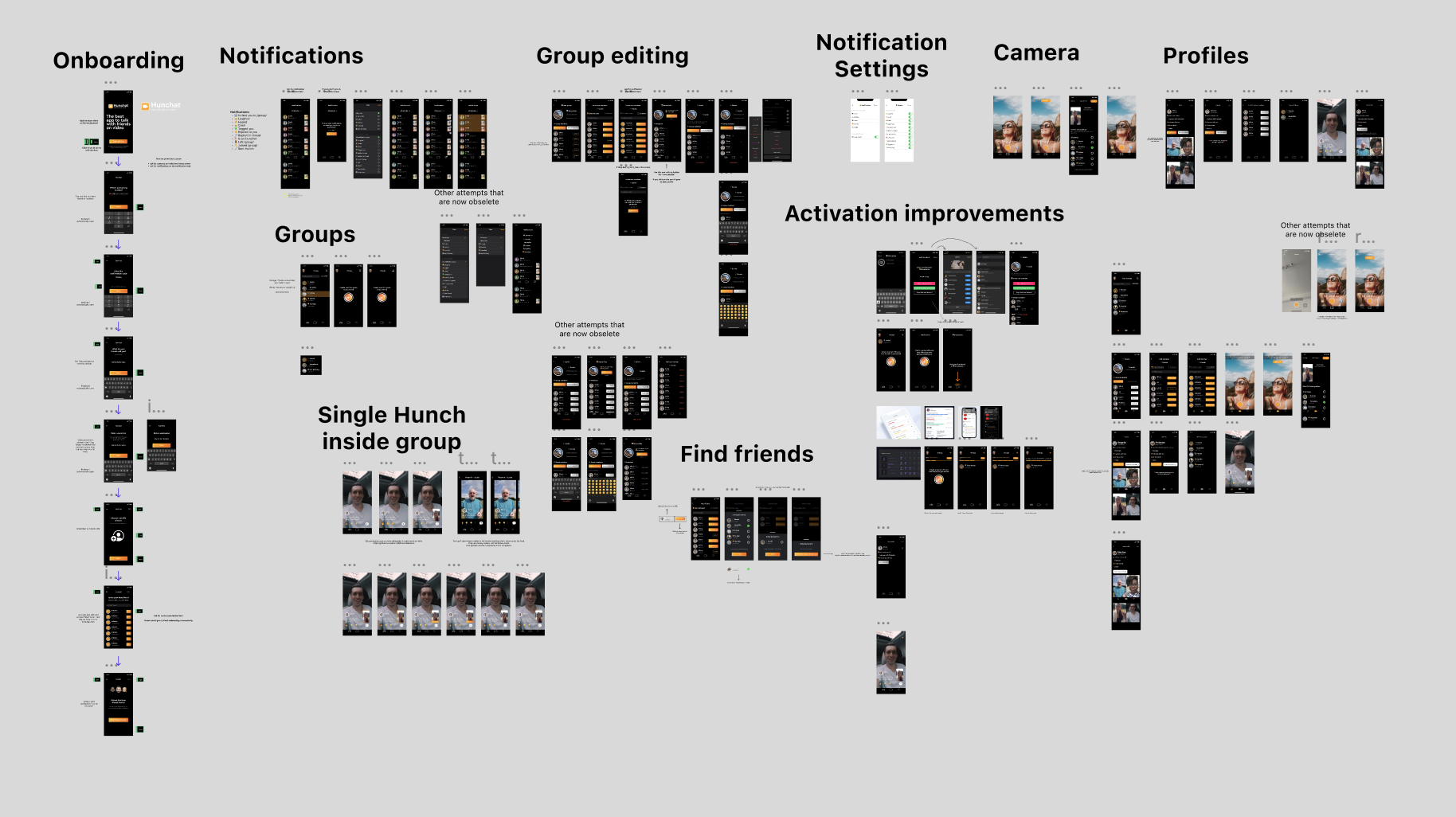
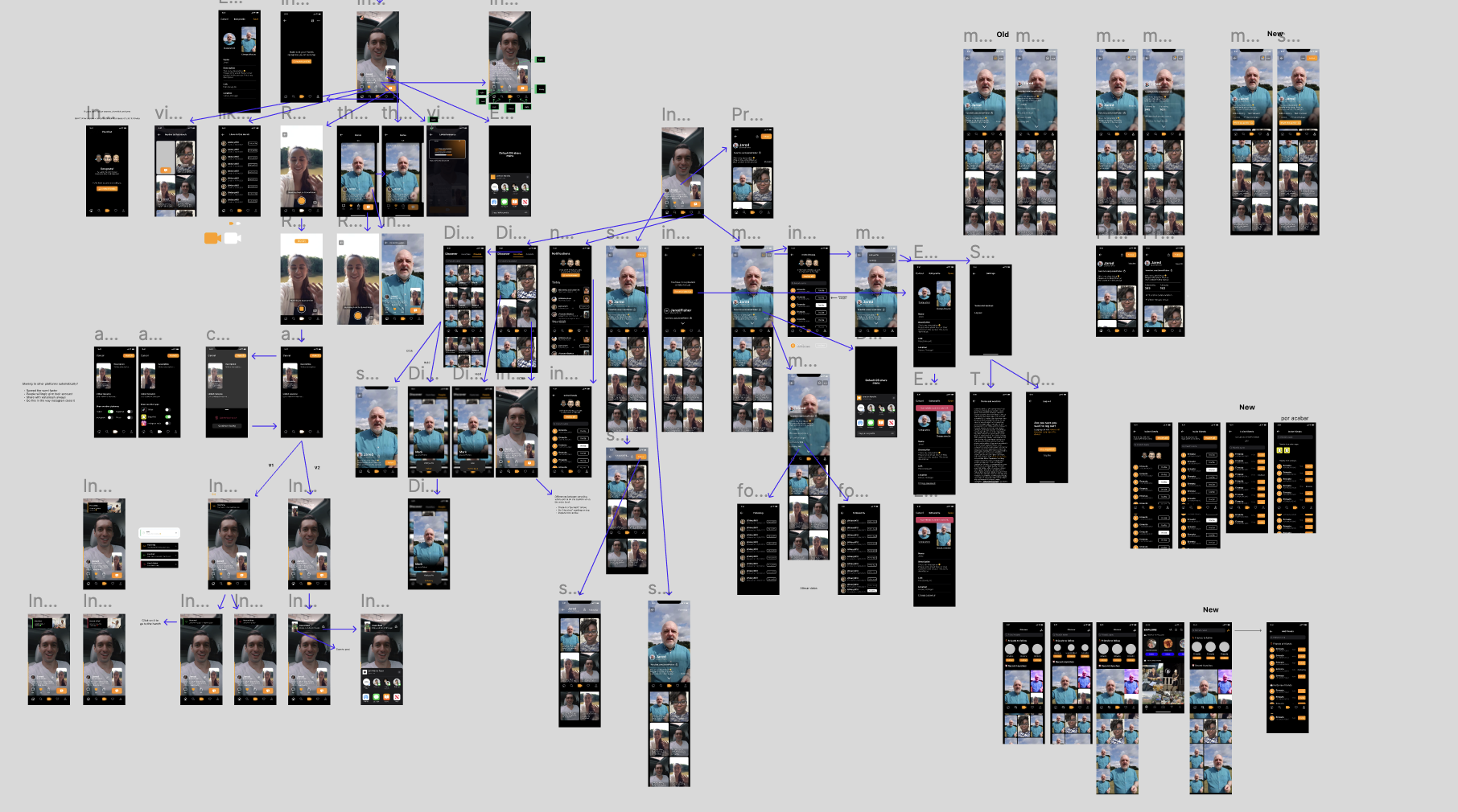
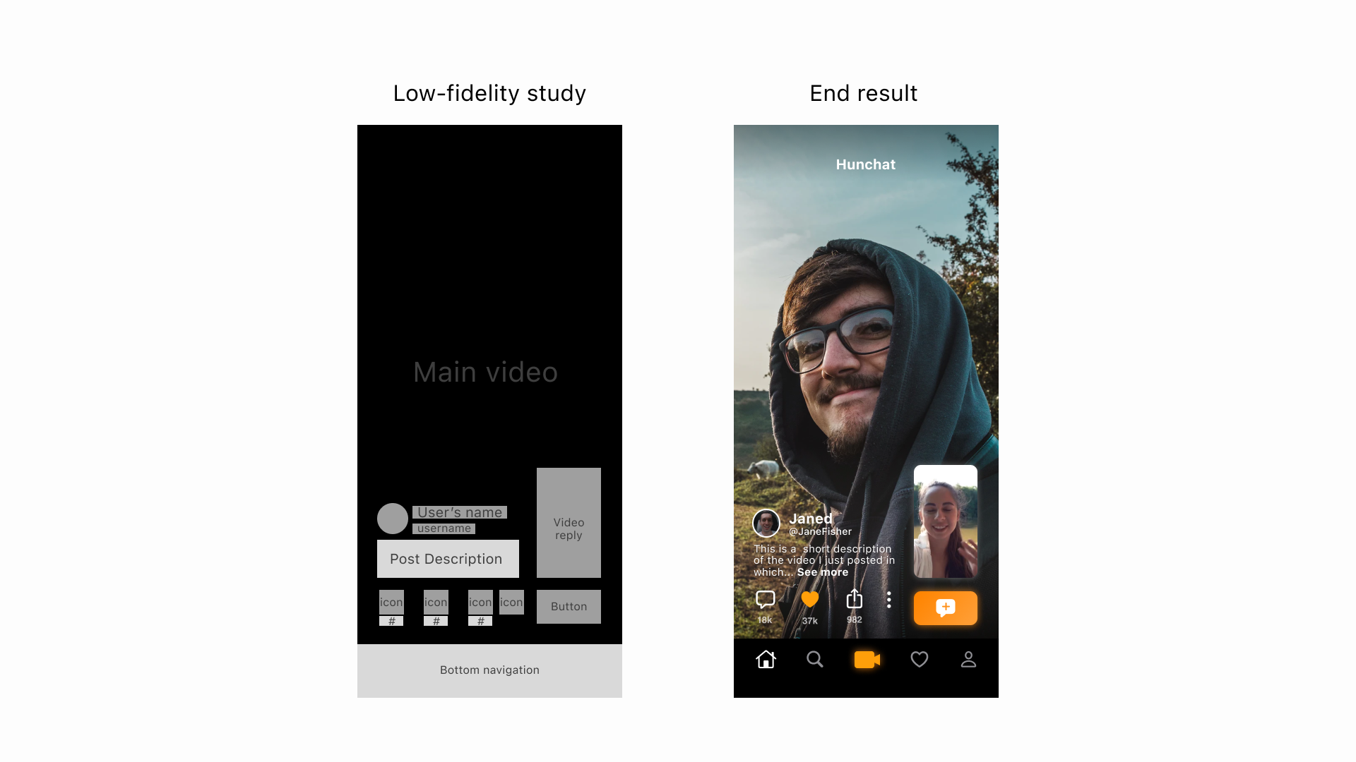
Every part of the app was prototyped with high fidelity in Figma and those prototypes were given to teenagers for them to use while we observed and took note of all the tasks they could and couldn’t accomplish.
Some of the most notable changes made in the app happened in the onboarding and camera module, where users had trouble performing some of the tasks given.
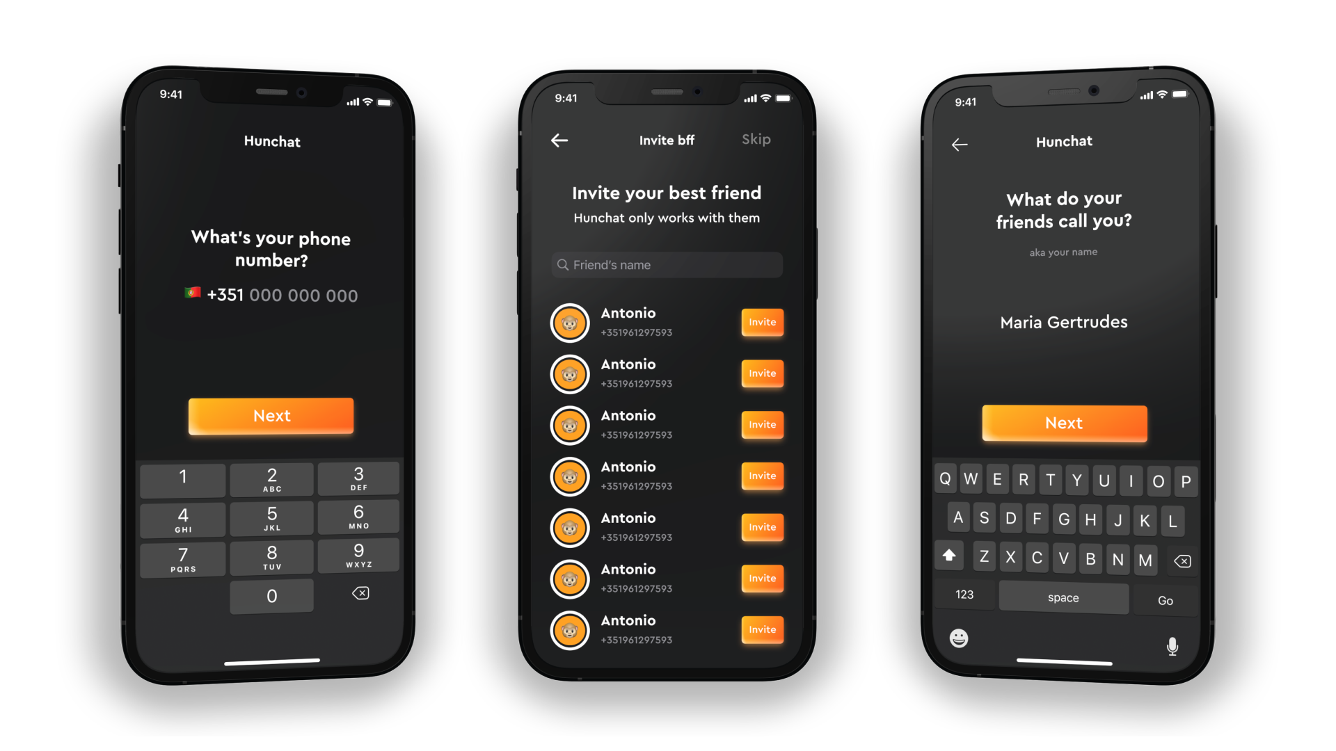
Mockups of some of the screens on the final onboarding
UX writing
In the consumer social market, a large part of the way a product is perceived, and thus whether teenagers use it or not, depends on its written communication.
Our landing page, app actions, notifications, tab names, and assistive texts were all designed to portray the app in a relaxed and personal way that teenagers respond well too. Changing the way the app speaks to its users from feature centered to relaxed and personal improved our conversion rates in many important funnels and changed the way teenagers spoke about the app with their friends.
Copy on some of the app's notifications in our users' style
Usage metrics shaping the product
After the app had been in the market for 1 month, we noticed that a large percentage of users were not publishing their first video.
When asked, users said that they:
- Were too shy to post videos for the whole world, given the intimate nature of the medium;
- Wanted to share things on video but certain people couldn’t see specific videos.
- To solve this issue we redesigned the app around group chats.
- I cover this topic extensively in the section “Shifting from public feeds into group chats”.
Shift in the product towards closed groups influenced by user feedback and usage metrics
Refining the designs
With the core structure and navigation well defined from the user tests with prototypes, at this stage, we focused on making the UI match the high expectations of our users and truly turn the app into a finished product that used all of the previous research and testing to delight our users.
If you want to know more about specific UX decisions that went into making each of the core screens of the app scroll down to “More details”.
Cinematic showcasing some of the design's details
Results
- Reached position #17 in the App Store’s social networking category;
- Created an objectively novel and interesting way to talk with friends on video;
- Managed to solve the UX problem of multi-threaded video conversations in the most elegant and user-friendly way we have seen online to date.
More details
Some details of the design process and UX decisions are stored in these dedicated sections for the sake of narrative clarity.
Browse them to explore each topic in-depth.
Final gallery