This page covers a specific part of a larger project - Hunchat
Solving information architecture for multi-threaded video conversations
Information Architecture | UX Design
Problem
Hunchat users want to have public video conversations with multiple friends. They also want to participate in other friends’ conversations at will.
There is currently no platform that allows this kind of interaction on video.
Challenges
- Lack of other platforms achieving the same thing from which to learn;
- Video needs to occupy large portions of the screen to be understandable;
- Allowing different conversations to exist under the same post.
Goals
- Allow users to have multiple public asynchronous video conversations with friends;
- Allow users to participate in other friends’ conversations at will.
- Achieve this in the most mobile and user-friendly way possible.
Approach
- Defining what kind of structure to build;
- Figuring out the best information architecture;
- Identifying the content users want to see;
- Designing a 3-screen-system;
- Introducing intuitive gestures;
Defining what kind of structure to build
Right now there are two ways to allow users to have public conversations with other users under one post and participate in other users’ conversations at will: Single-threaded, and Multi-threaded content.
Single-threaded posts are what slack uses to organize conversations.
Multi-threaded posts are the threading system used by Twitter.
While single-threading is easier to use, multi-threading allows for more diverse conversations to happen under each post, which allows Clara - our ideal user - to talk about her wide range of interests in separate conversations. For this reason, we chose to proceed with multi-threaded conversations and committed to making them extremely easy to use.
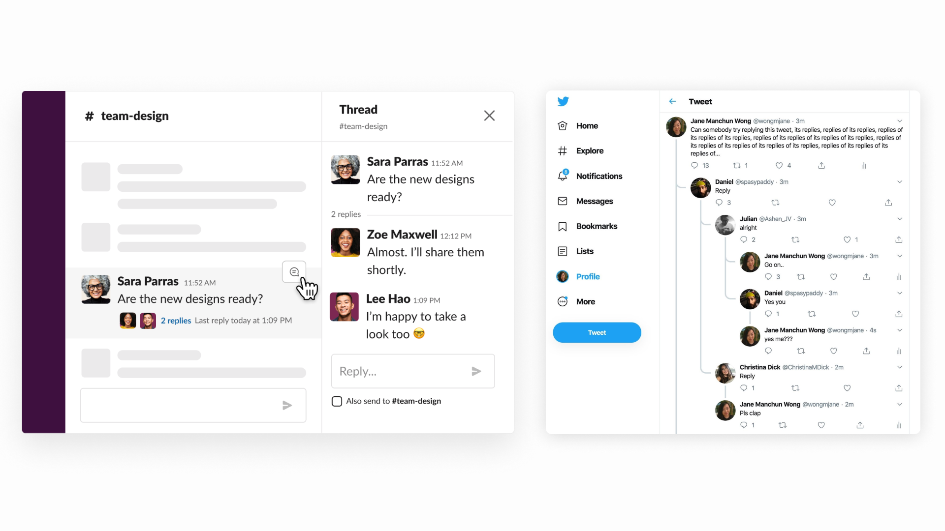
Slack's single-threaded solution and Twitter's multi-threaded solution
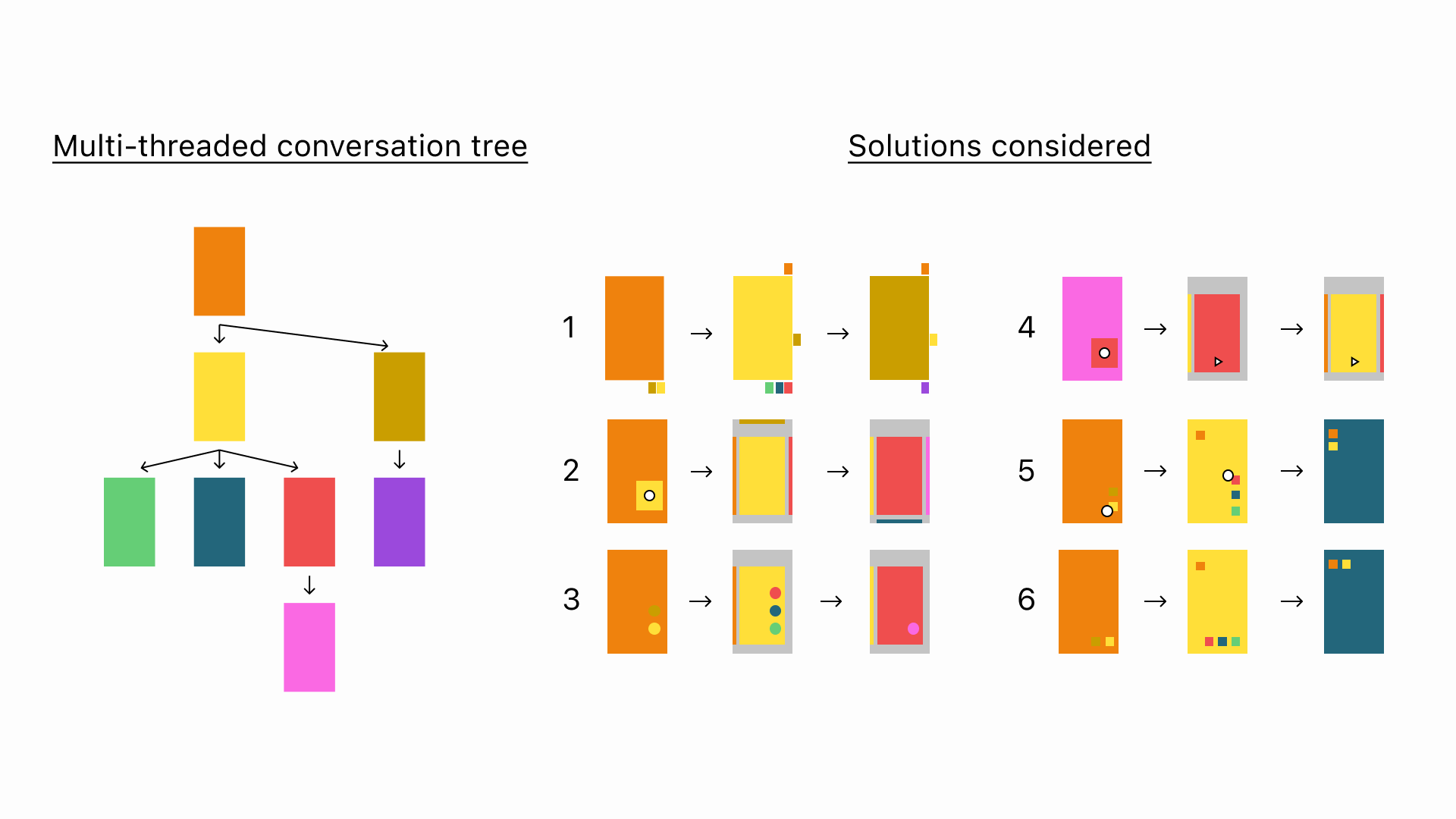
Figuring out the best information architecture
How can we display multiple video threads on a mobile screen while giving the user an overview of where he is in the conversation? Achieving this in a user-friendly way was extremely challenging.
The main problem was that the proposed solutions were either too complex for the average social media user to understand in under 5 seconds or too simple to give an overview of where users stood within the larger conversation.
Here is a very simple overview of some of the proposed solutions. I will not get into the details of every one of them here, but will happily do so 1-on-1 if you reach out.
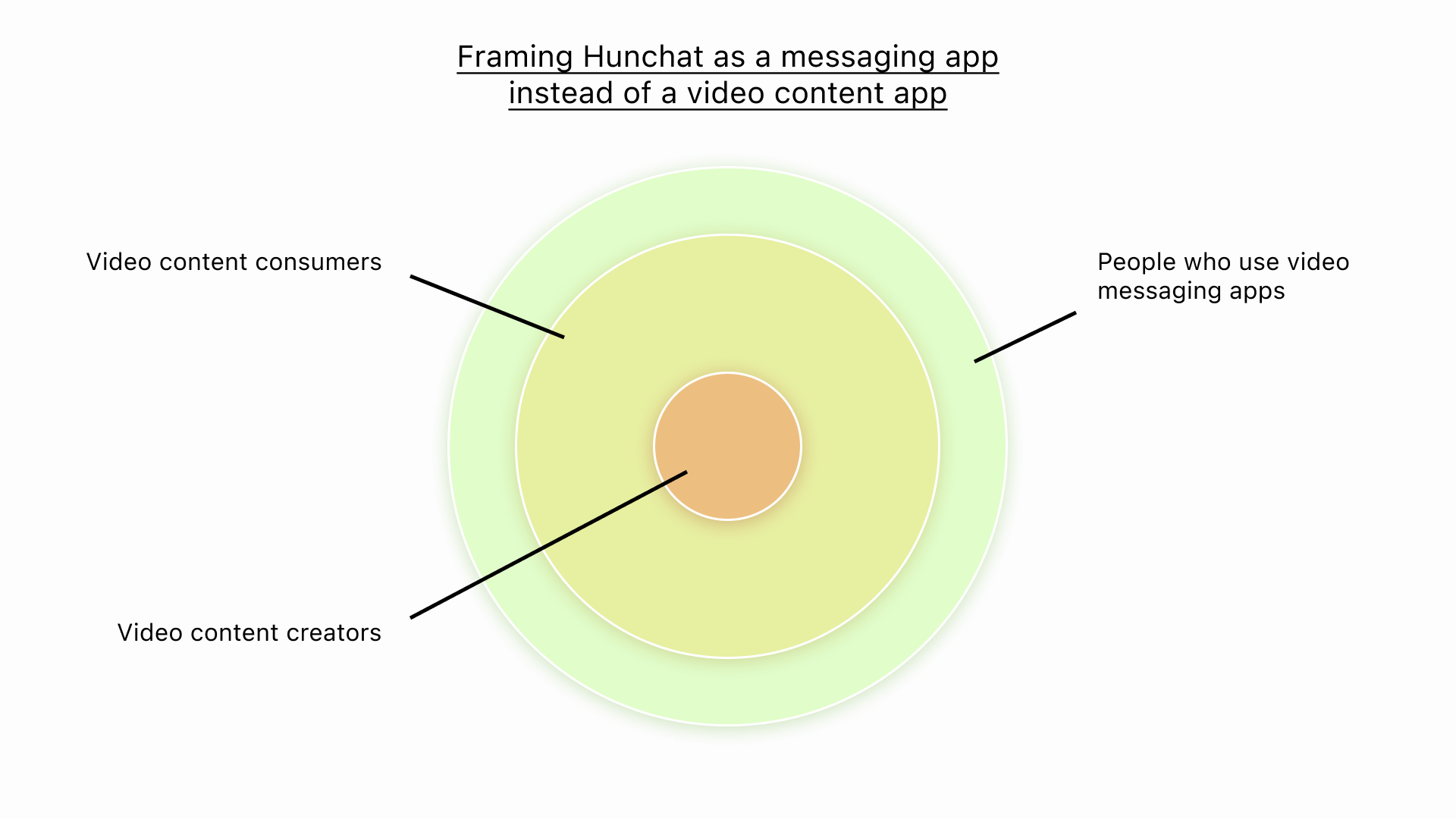
Hunchat's market positioning
Identifying the content users want to see
Identifying the content that users want to see ia as important as presenting it properly.
There are two kinds of conversations users should be shown above all others:
- Conversations between their friends;
- Conversations they are part of.
There are then more nuanced cases like a video that has replies from 2 different friends. In that case - and in line with the business goals of the app - we prioritize the video with the most engagement because that is the one more likely to generate a response from the users seeing it. In the case a video has 2 different replies from 2 different friends and those replies have the same engagement - again in line with the business goals - we display the one from the friend with whom this user interacts more often.
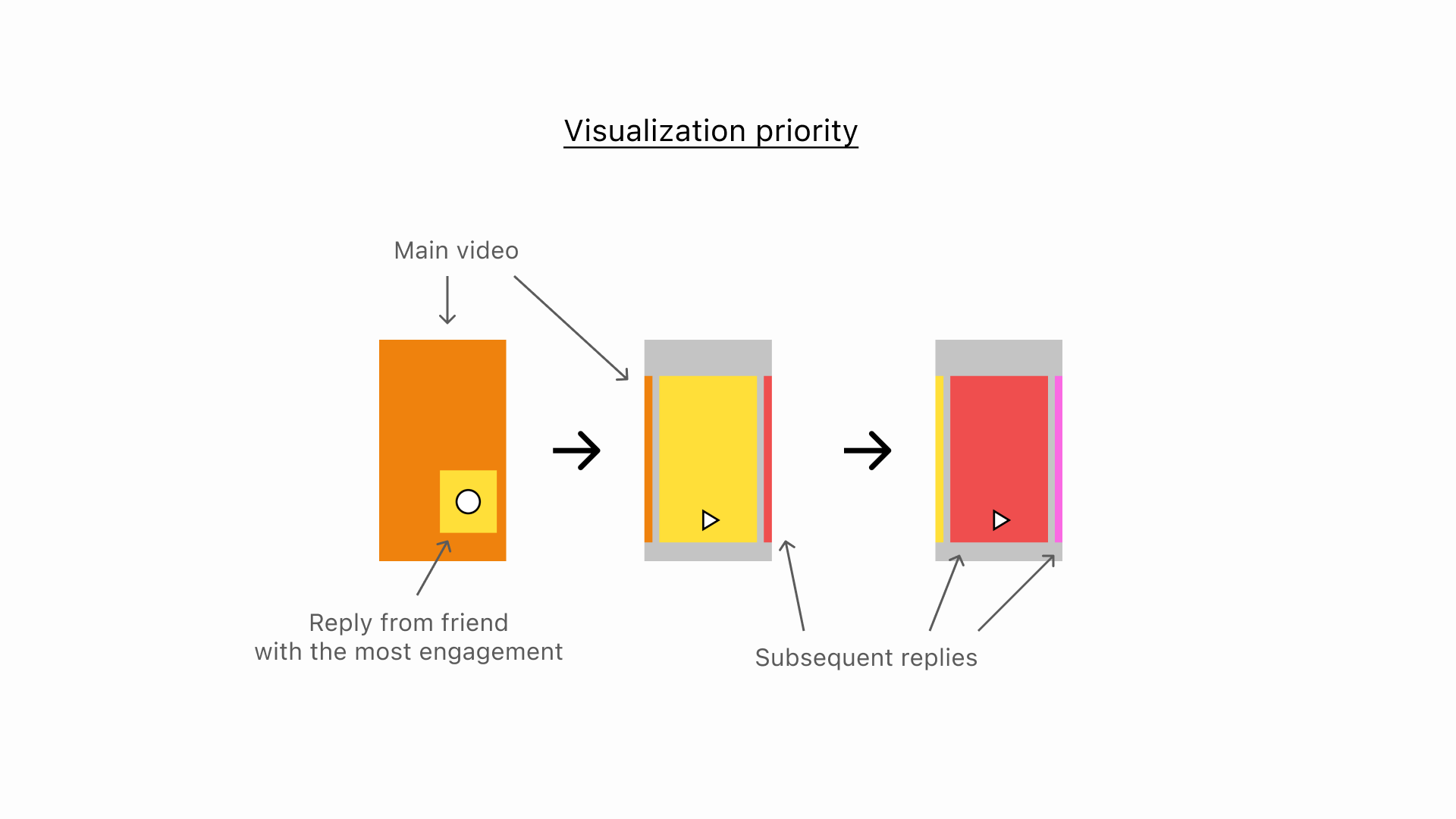
Vizualization priority in the chosen IA solution
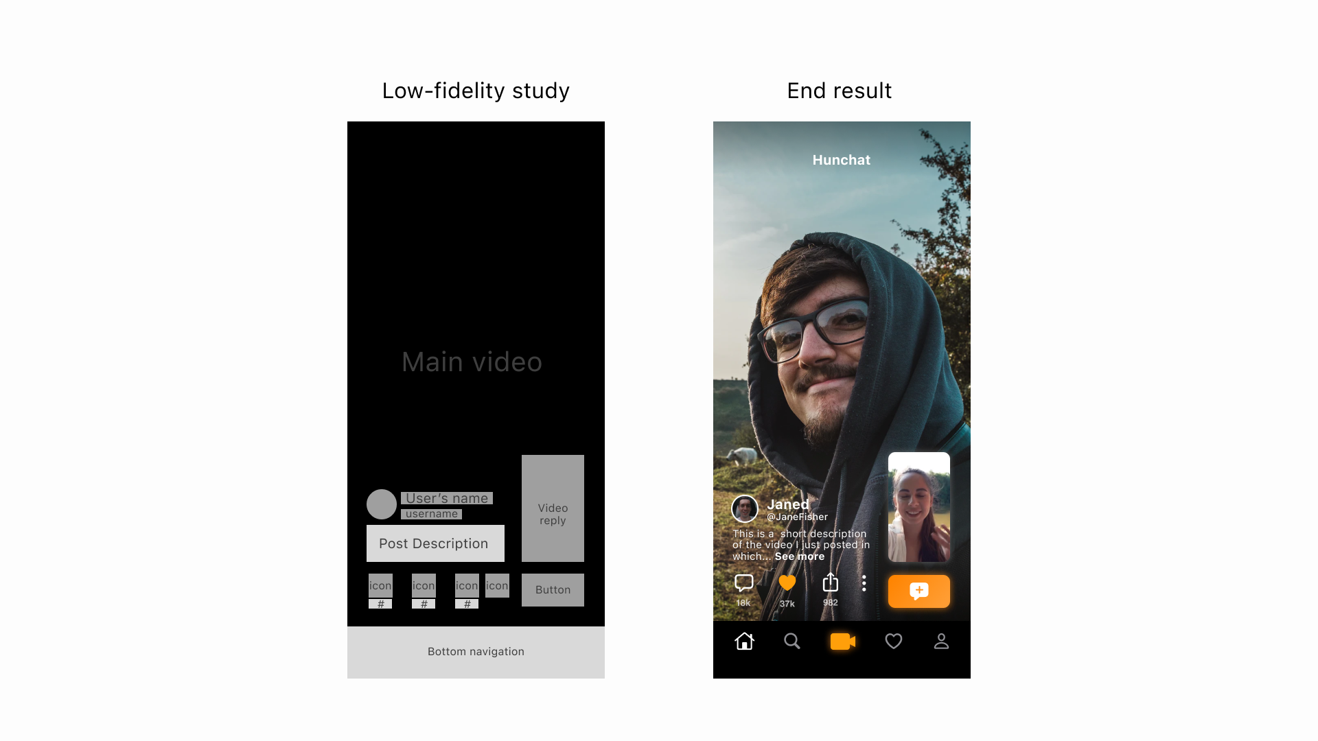
Designing a 3-screen-system
The final information architecture for multi-threaded video conversations is composed of 3 screens.
The “Main post” screen has the main video in full screen, a preview of the most important reply, and a button leading to all other 1st degree replies to the full-screen video. This ensures that the user is given space to be immersed in the main video, see a preview of the relevant content that comes next to keep him/her engaged, and also has the option to click on a button to quickly see all other replies to the main video.
The “All replies” screen is a simple list of all 1st degree replies to a video that users can click through.
The “Thread view” screen shows a horizontal scroll of replies that users can swipe through to view. All of the replies within a conversation are easily accessible by simply swiping left or right. The user is also always aware of where he is within the conversation tree thanks to the videos showing both to the left and right of the reply currently being watched.
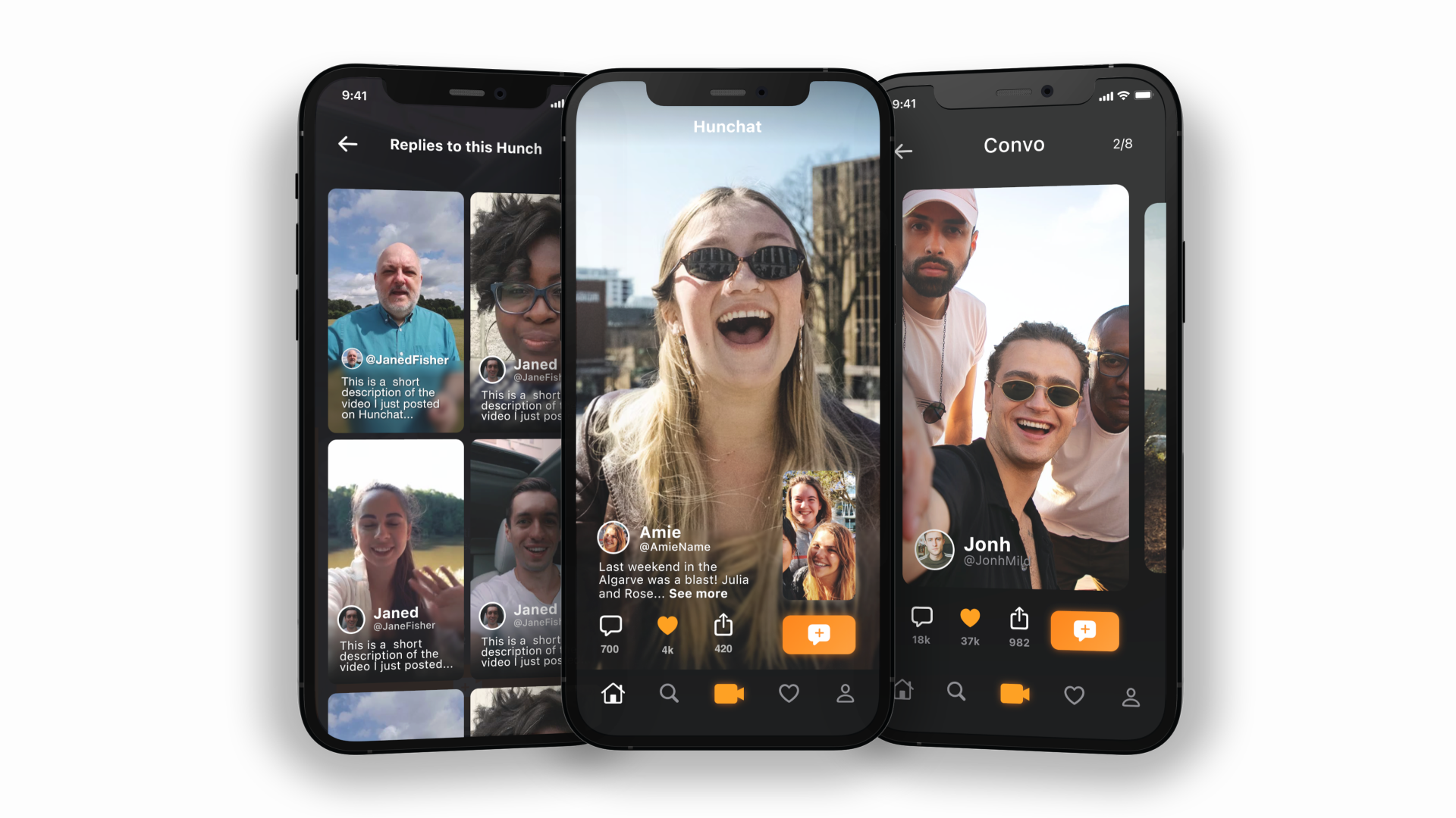
Left to right: All replies, Main screen, Thread view
Introducing intuitive gestures
Another important aspect of this solution is its impact on navigation within the app.
With this solution, users will swipe vertically to navigate between different conversations and horizontally to navigate replies inside conversations. This allows them to develop muscle memory and navigate the app intuitively without thinking.
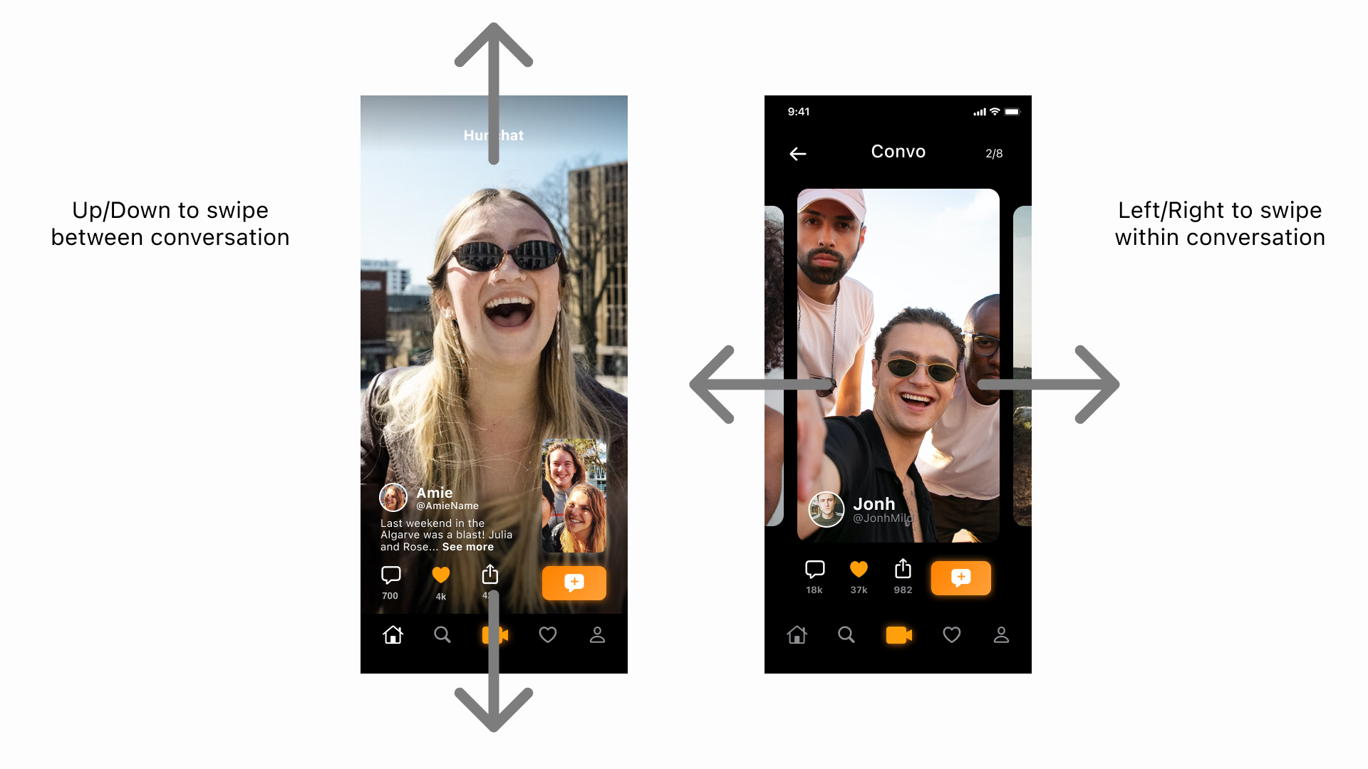
Swipe actions in threads
Results
In the end, we reached an elegant solution that:
- Is multi-threaded;
- Allows users to have multiple public synchronous video conversations;
- Allows users to participate in other friends’ conversations at will;
I easy to understand; - Gives users enough pieces of information about where they stand in the whole conversation;
Multi-threaded conversations UI showcase