This page covers a specific part of a larger project - Hunchat
Designing the onboarding
UX Design | UI Design
Problem
A large percentage of mobile app users churn before they ever get to really try the product, especially when they need to create an account.
Challenges
- Collecting enough data to create an account while keeping the process frictionless;
- Making users understand why we need certain permissions;
- Giving an overview of the app that users actually enjoy.
Goals
To avoid losing users during the onboarding I set out to build an onboarding flow that:
- Keeps users engaged;
- Gives users an overview of the app;
- Is it as frictionless as possible.
Approach
- Trying different account creation flows;
- Putting permissions into context;
- Presenting the app in a few seconds.
Trying different account creation flows
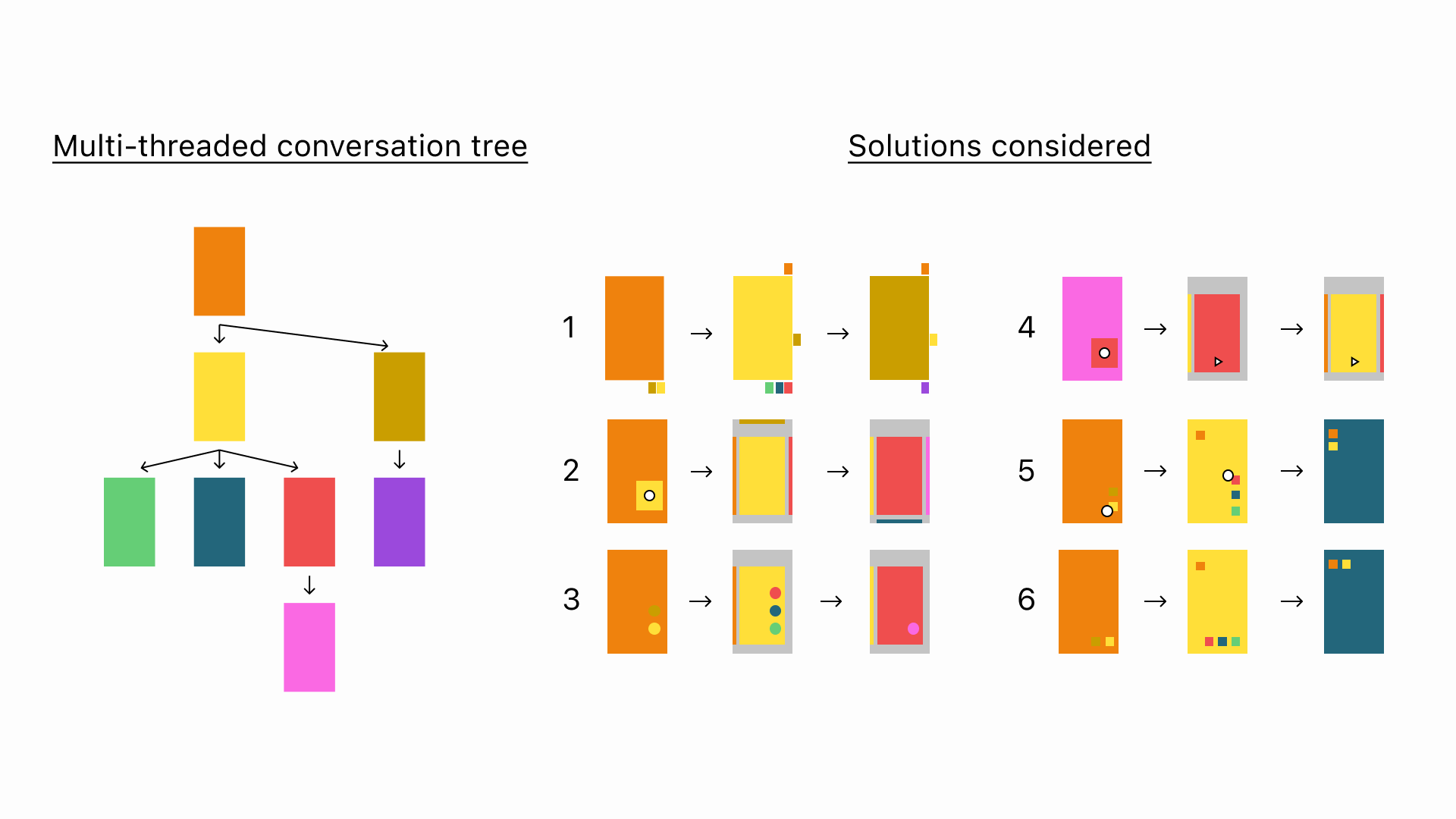
Some designers argue that the right course of action is to gather as much information about users as possible from the beginning because they are then more likely to stick to the app, others argue the opposite: that you should require as little information as possible.
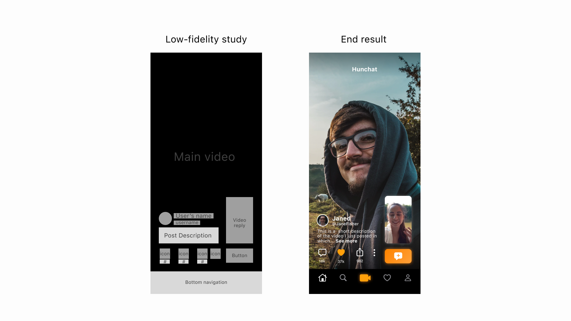
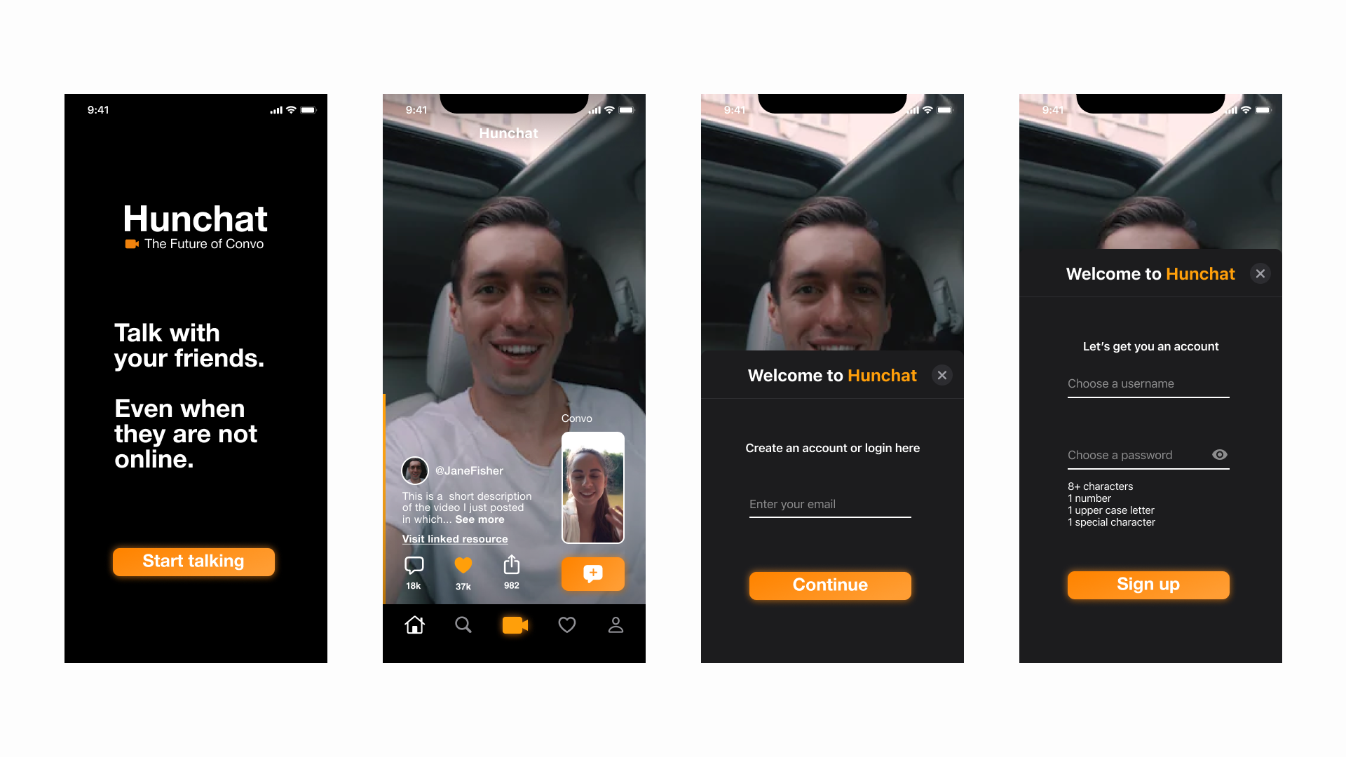
We decided to try both approaches - out of naivety - and started by asking for a complete profile creation during onboarding.
In this first approach users were asked for an email, password, profile picture, bio, username, and video bio before getting in the app
Users started to post black videos as their video bio and write random words in their bio just to speed up the process, so we looked into a less demanding option:
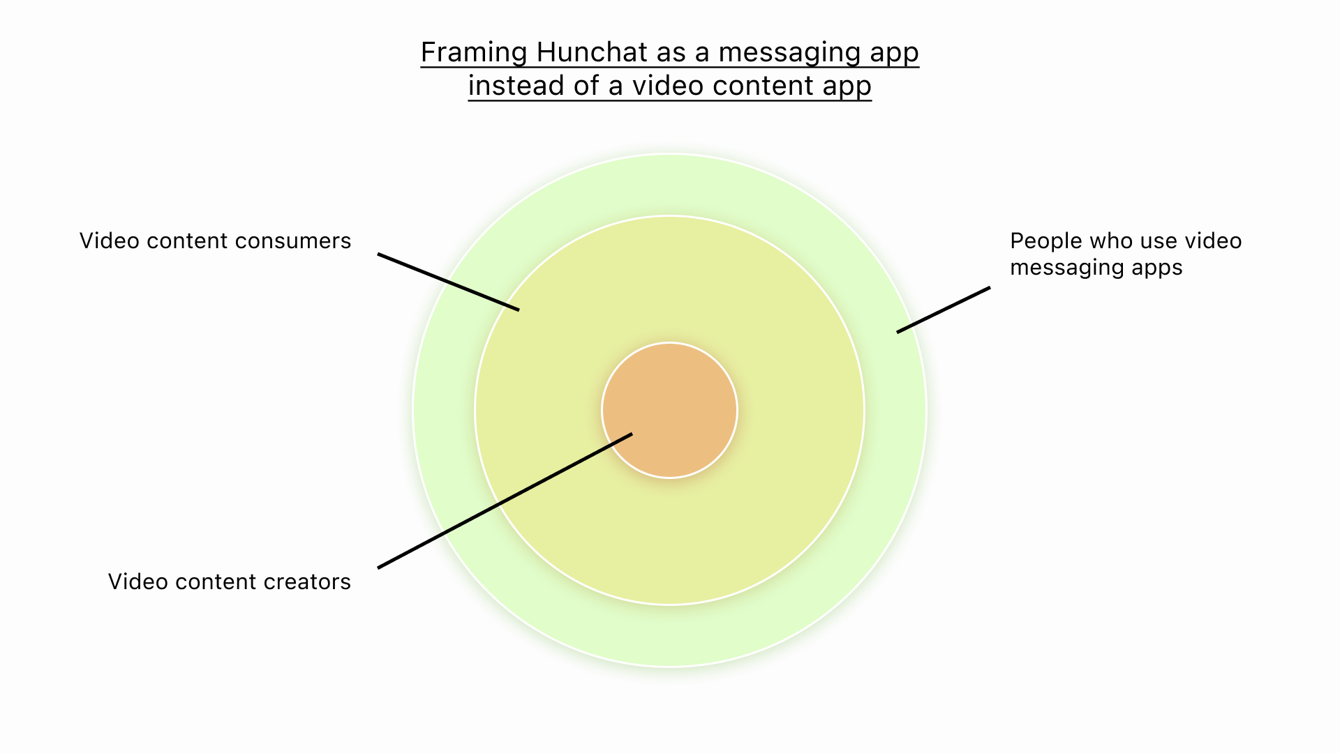
What if we allowed teenagers to use the app before even creating the account? The app “Thriller” allows anyone to open the app and immediately start browsing through videos, only asking their users to create an account when they try to engage with the video.
After weighing the pros and cons, we decided against using this model, but already had some prototypes ready that looked like this
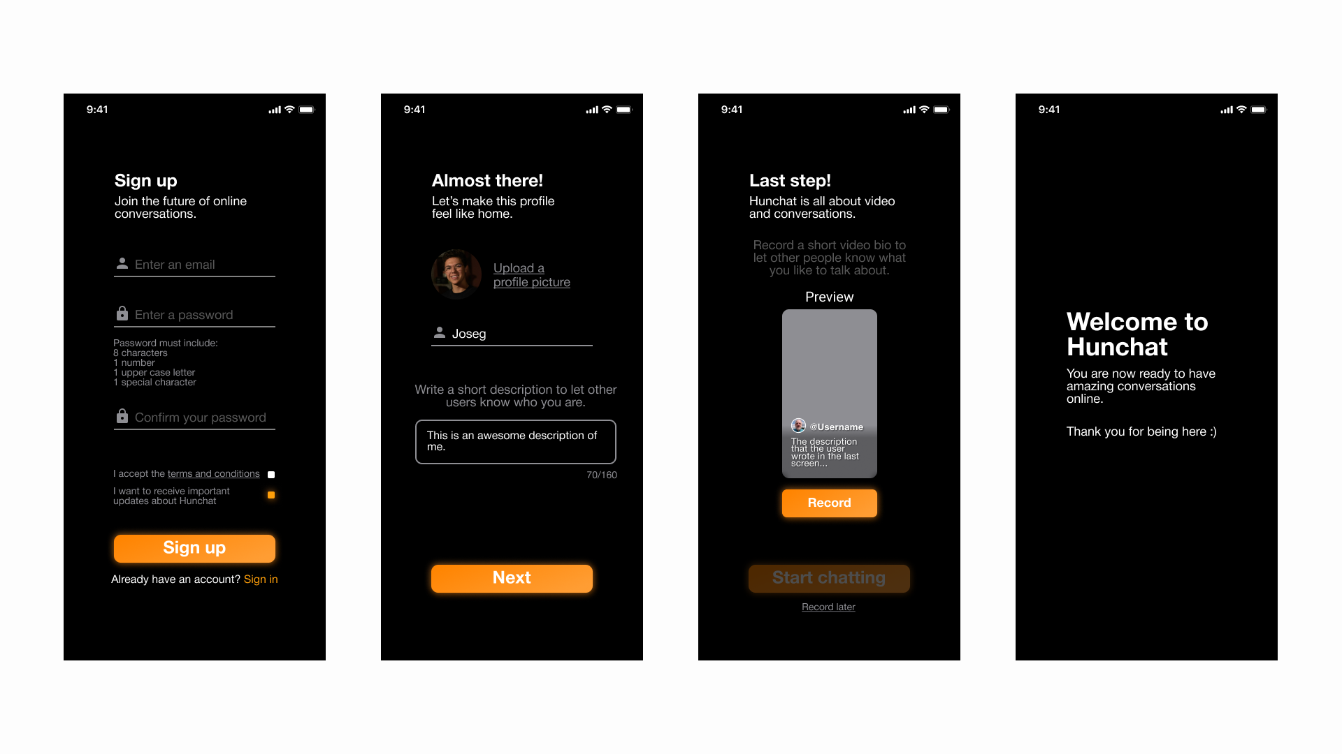
In our third tackle at the onboarding question, we looked at what the winning apps in our category were doing and one thing was clear: account creation was being done through phone numbers.
We went on to do a lot of research from key players in our market and design a flow that combined the best of all of them.
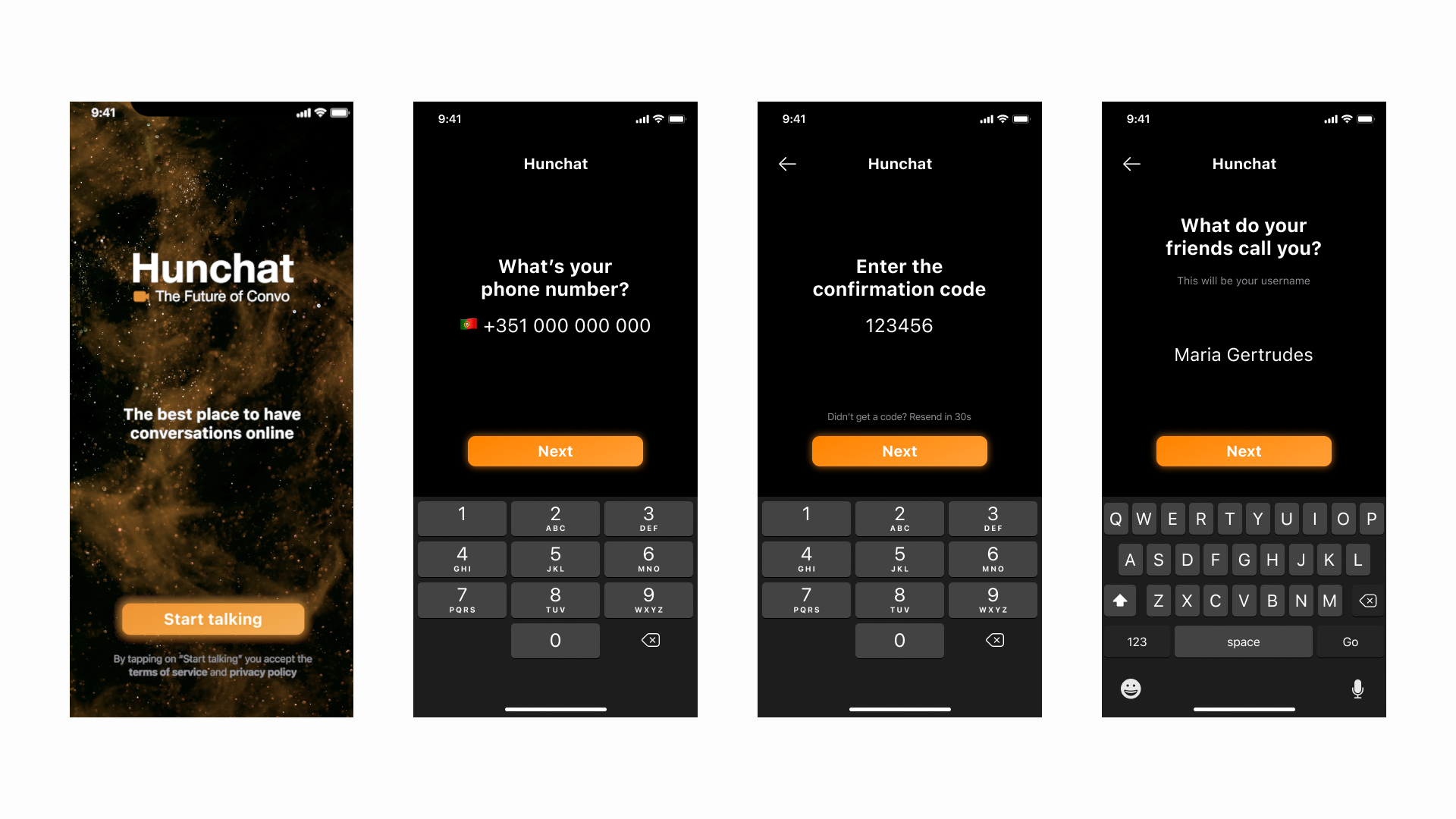
Onboarding with phone number based account creation
Putting permissions into context
Having access to a user’s notifications, contact list, and camera is crucial to give them the best possible experience within Hunchat. This step introduces a lot of friction in the onboarding process because these are 3 separate iOS pop-ups that users need to click on.
In our first versions, we would ask for all 3 of these permissions right as the user started creating the account but upon observing our users creating accounts and being scared by the 3 pop-ups, we realized that this was not the way to go.
To fix this problem, we started asking for permissions in the context that users needed them.
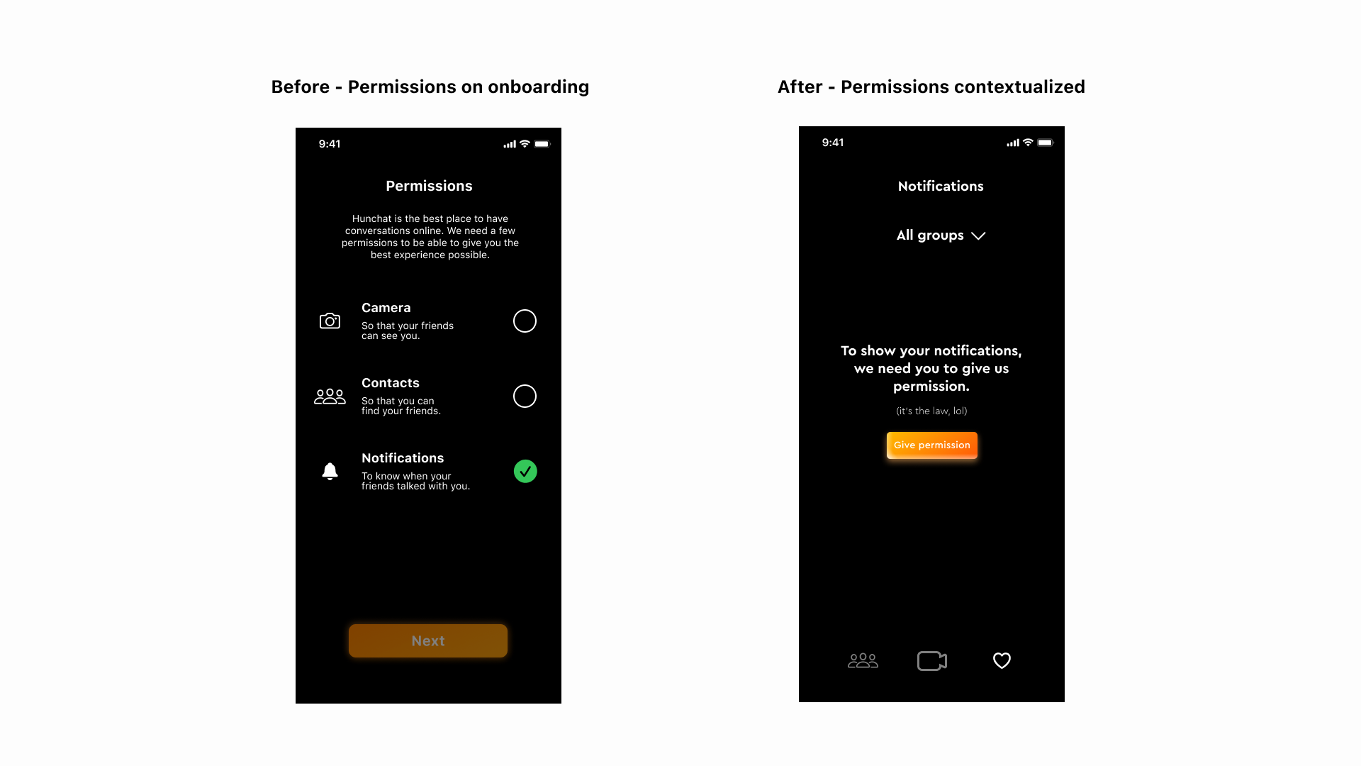
Example of eliminating the permissions screen and asking for them when we need to
Presenting the app in a few seconds
Being a video app, we decided to do a 10-second fast-paced video that starts playing when users open the app for the first time that explains the value proposition in a fun way. This achieves the goal of explaining the core value prop while also differentiating our app from our competitors and looking like a high-quality app.
Quick app wakthrough on 1st launch
Results
By the end of the redesign, 95% of the users who installed the app ended the account creation process.
User completing the onboarding process