This page covers a specific part of a larger project - Hunchat
Designing the main feed
UX Design | UI Design
Problem
Users need to feel invited to engage in video conversations and have all the tools to do so at their fingertips. They need to find the content relevant enough to keep watching and understand what is happening at all times and how that ties in with the other sections of the app.
Challenges
- Managing high amounts of information and actions in one screen;
- Keeping the full-screen video unobstructed;
- Organizing actions according to their priority.
Goals
- Show relevant content to users;
- Incentivize users to engage in video conversations;
- Have users understand what is happening at all times;
Approach
- Understanding what needs to be on the main feed;
- Defining the layout.
Understanding what needs to be on the main feed
At this stage in the design process, I had already defined how the multi-threaded information architecture was to be displayed and researched what our users wanted to do on the app, so understanding what needed to be on the main screen was a matter of revisiting those sections of my research and aligning their insights with the design.
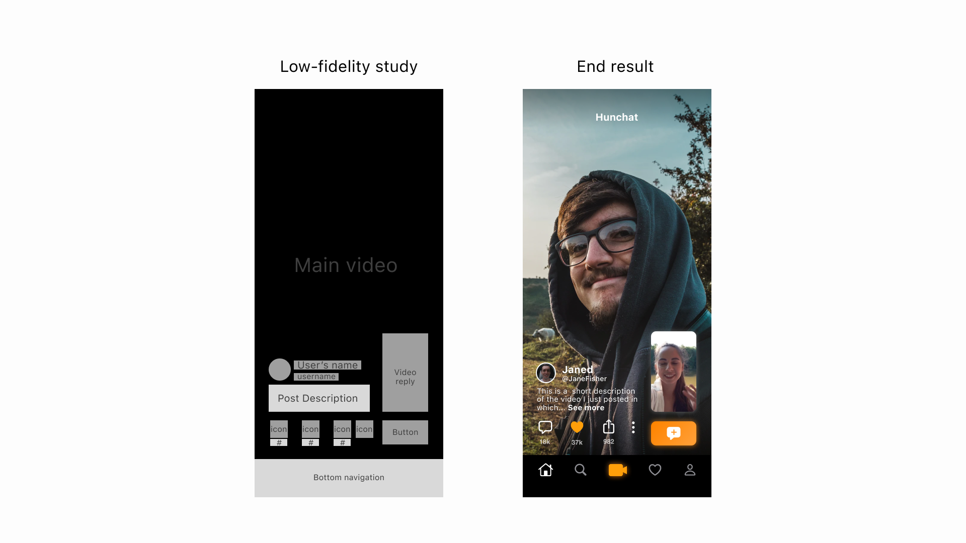
Low-fidelity content study compared to the end result
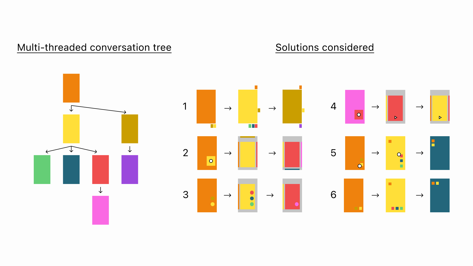
Defining the layout
To say that this phase went through a lot of experimentation would be an understatement.
I allowed myself to play during the experimentation phase which resulted in these results and more:
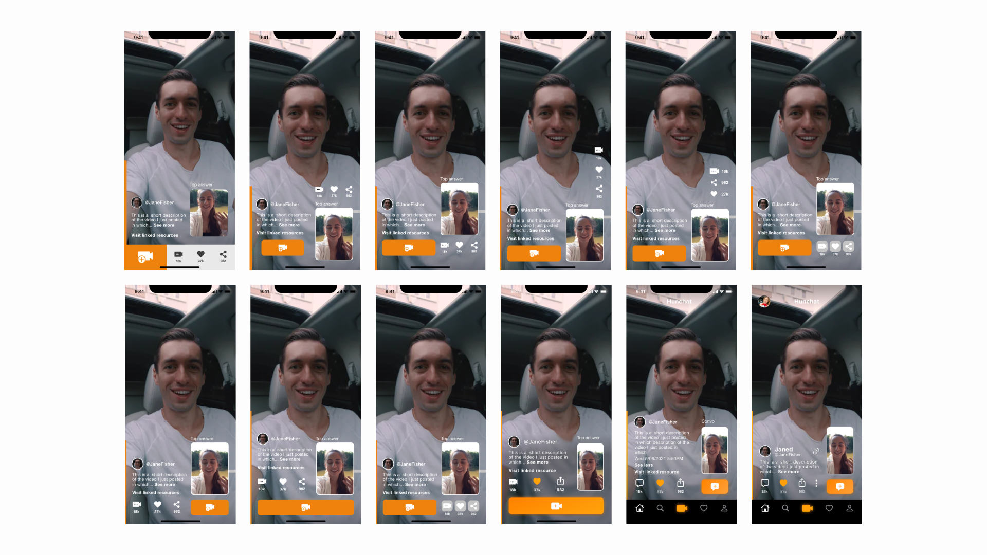
Some of the layout and the UI elements done
Results
The end result accomplished the goals outlined above.
The main actions are clearly highlighted and easy to understand, and keep all other actions accessible within the “thumb zone”. All of this while keeping the main video acceptably unobstructed.
Main feed UI showcase