This page covers a specific part of a larger project - Hunchat
Shifting from public feeds into group chats
Research | UX Design | UI Design
Problem
Two months into the launch of Hunchat, user retention metrics, meaning the number of users who still use the app N days after installing it, were sub-par and that needed to quickly improve.
Challenges
- Short time frame to find a working solution;
- Figuring out why user retention was low;
- Putting previously built UI elements to new use.
Goal
- Increase user retention rate.
Approach
- Identifying the problem;
- Talking to users;
- Ideation;
- Implementing private groups;
- Incentivizing the first post;
Identifying the problem
We turned to our existing users and individually analyzed their usage data to try and find meaningful patterns. Some users were staying on the app and others were leaving, and we needed to identify exactly what the differences between these two groups were.
After digging through the data, we found out that users who posted at least one video on Hunchat were way more likely to stick around than those who never posted anything.
This - posting their first video - was the single event with the most impact on a user’s retention, so we defined a clear goal: get as many users as possible to post for the first time.
Talking to users
We reached out to users who never made their first post in an attempt to understand what was preventing them from doing so.
The main feedback on the resistance to post for the first time was:
- People are attracted to the medium and the concept but are too shy to post for the whole world (most people are consumers, not creators);
- People want to talk using video, but conversations cannot always be listened to by everyone;
- By knowing that it was public, people thought of a Hunch as “content” instead of a “conversation”, which lead to them thinking that they “had nothing to say”.
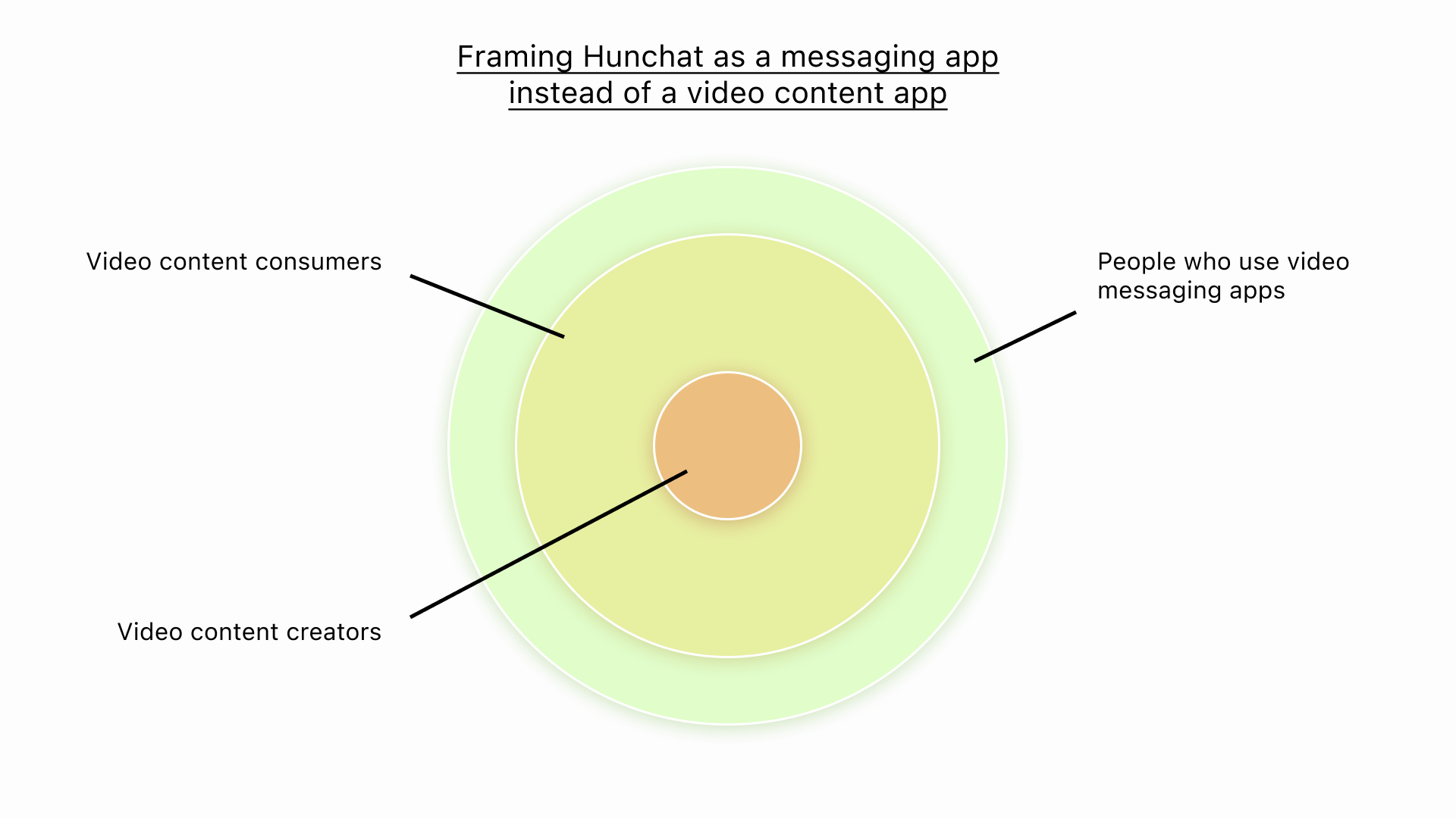
A new narrative to encourage posting
Ideation
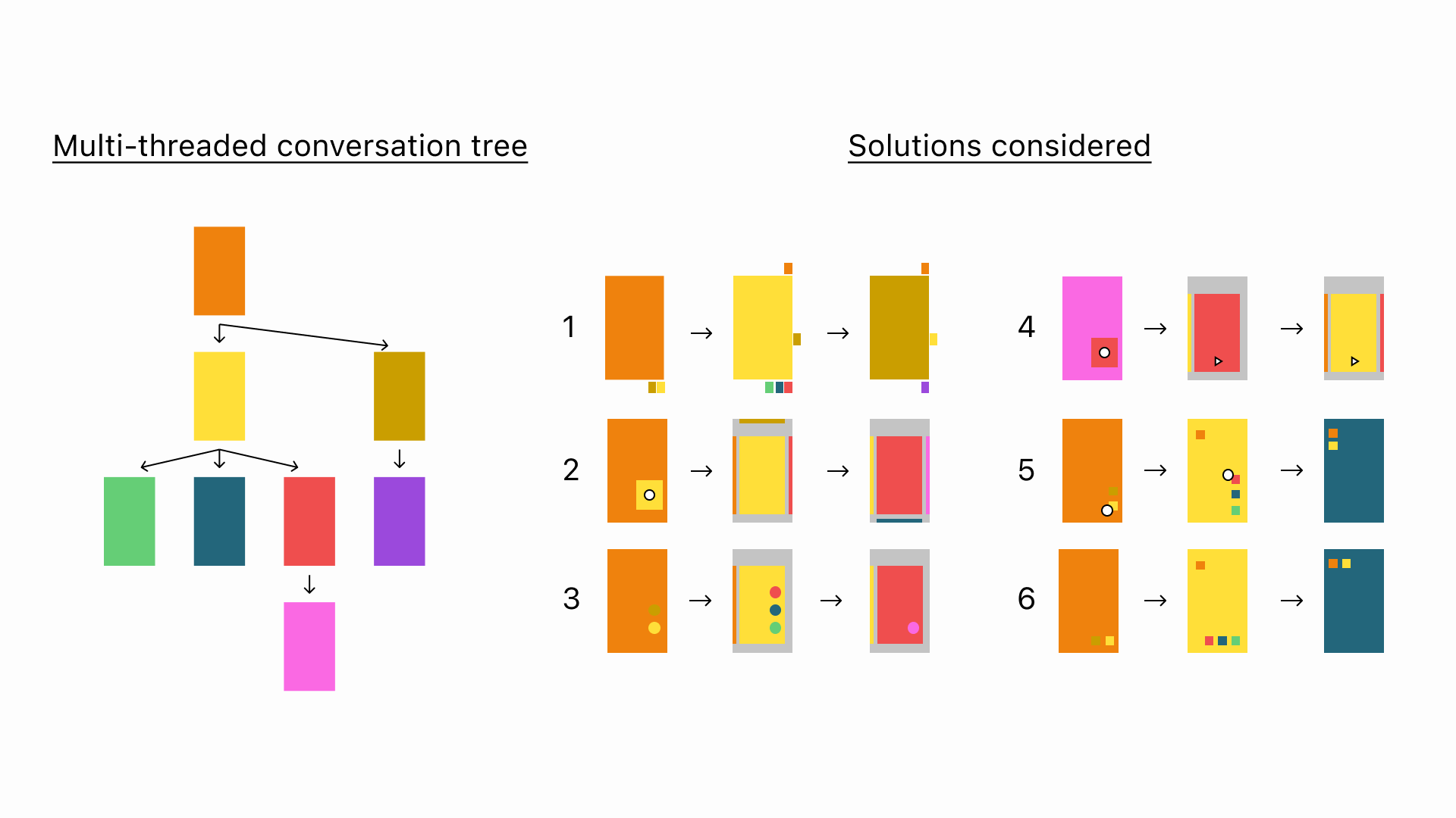
To tackle this, we explored a myriad of changes we could make to our existing app to fix these issues, ranging from different incentive systems, private chats, group chats, and stories-like features, among others.
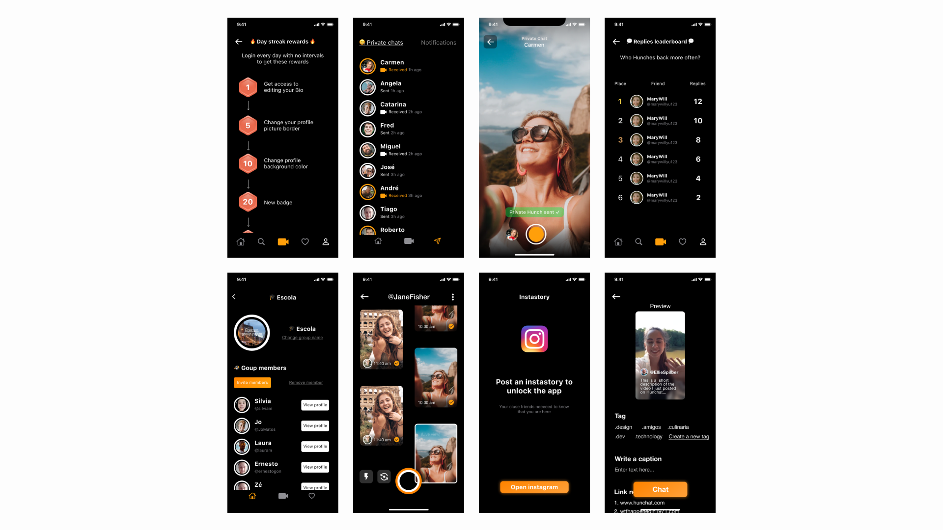
Some of the different ideas we explored
Implementing private groups
After talking further with users and considering our options decided to develop a groups feature.
Now, instead of completely public content, each feed on Hunchat belongs to a private group and only the members can see it.
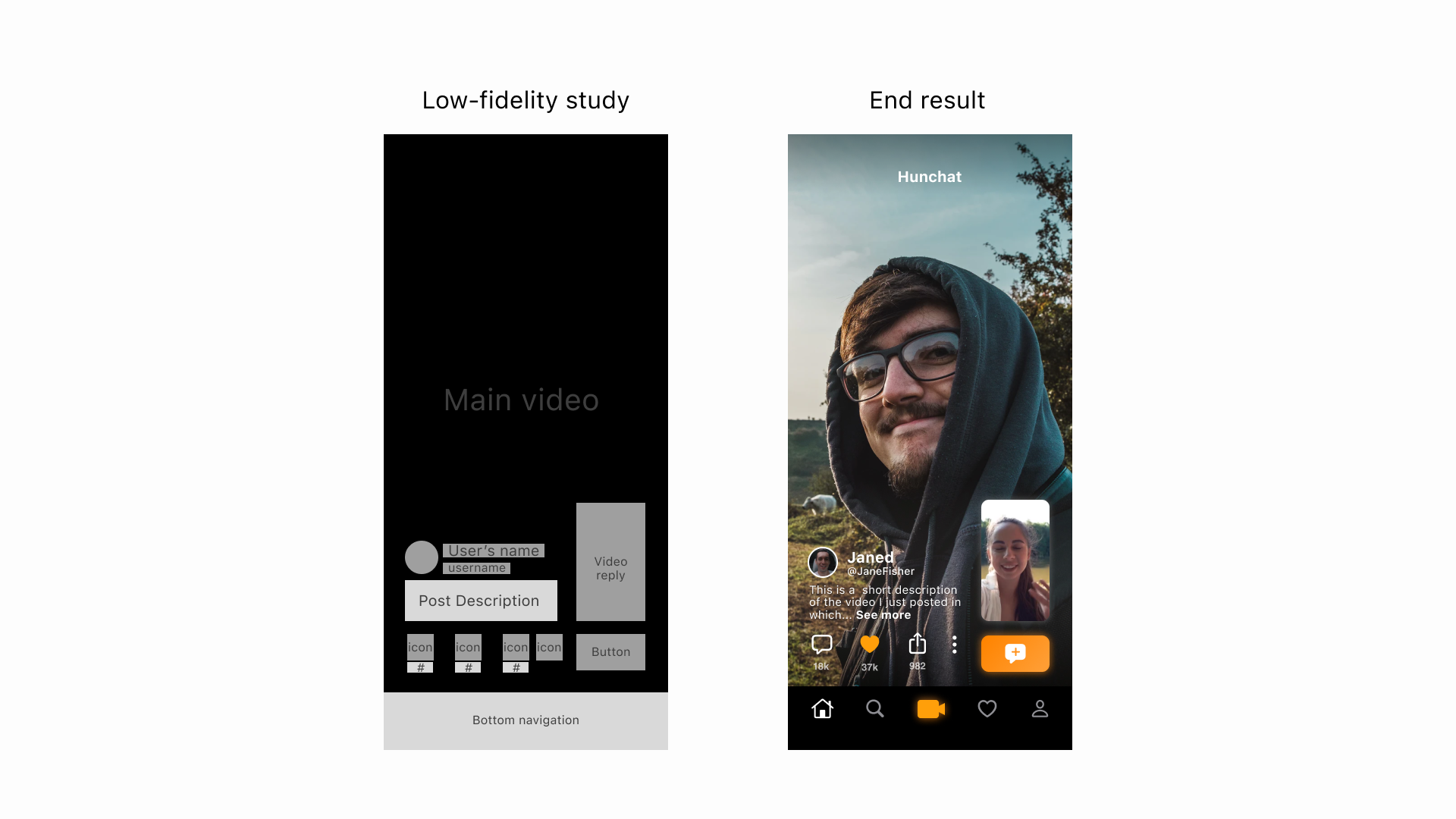
To achieve this in the shortest time possible, we used as many atomic elements from our previous designs as possible. This use of past building blocks enabled us to develop this group version of the app from concept to production in just 2 months.
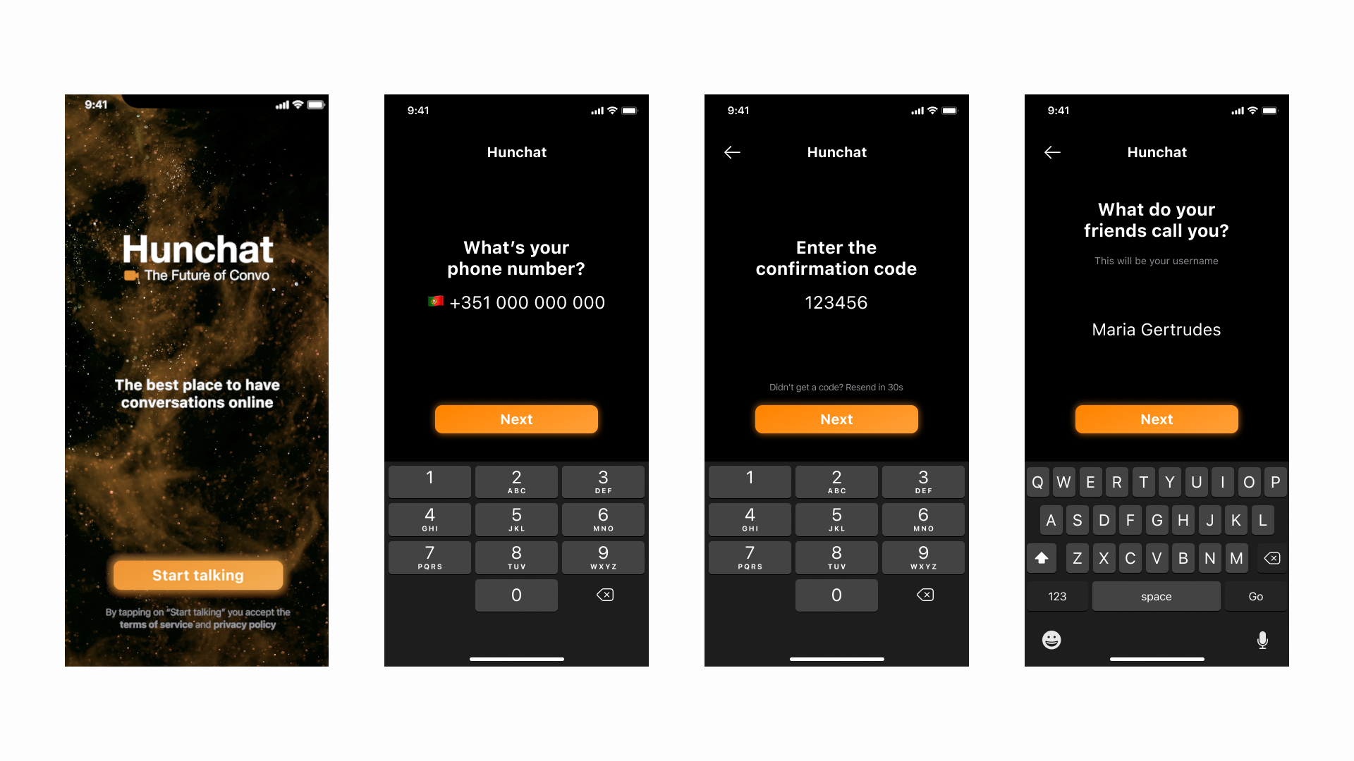
User completing the onboarding process
Incentivizing the first post
In addition to the transition towards private groups, we were especially careful to incentivise users to post for the first time as soon as they got into the app and developed an onboarding flow that helped them do just that. This resulted in more people actively engaging in the app on their first visit.
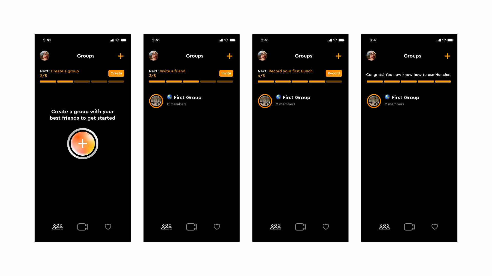
Onboarding flow optimised for engagement
Results
User retention metrics improved and users reported being way more comfortable and pleased using this new version of the app compared to the prior one.
User completing the onboarding process

